
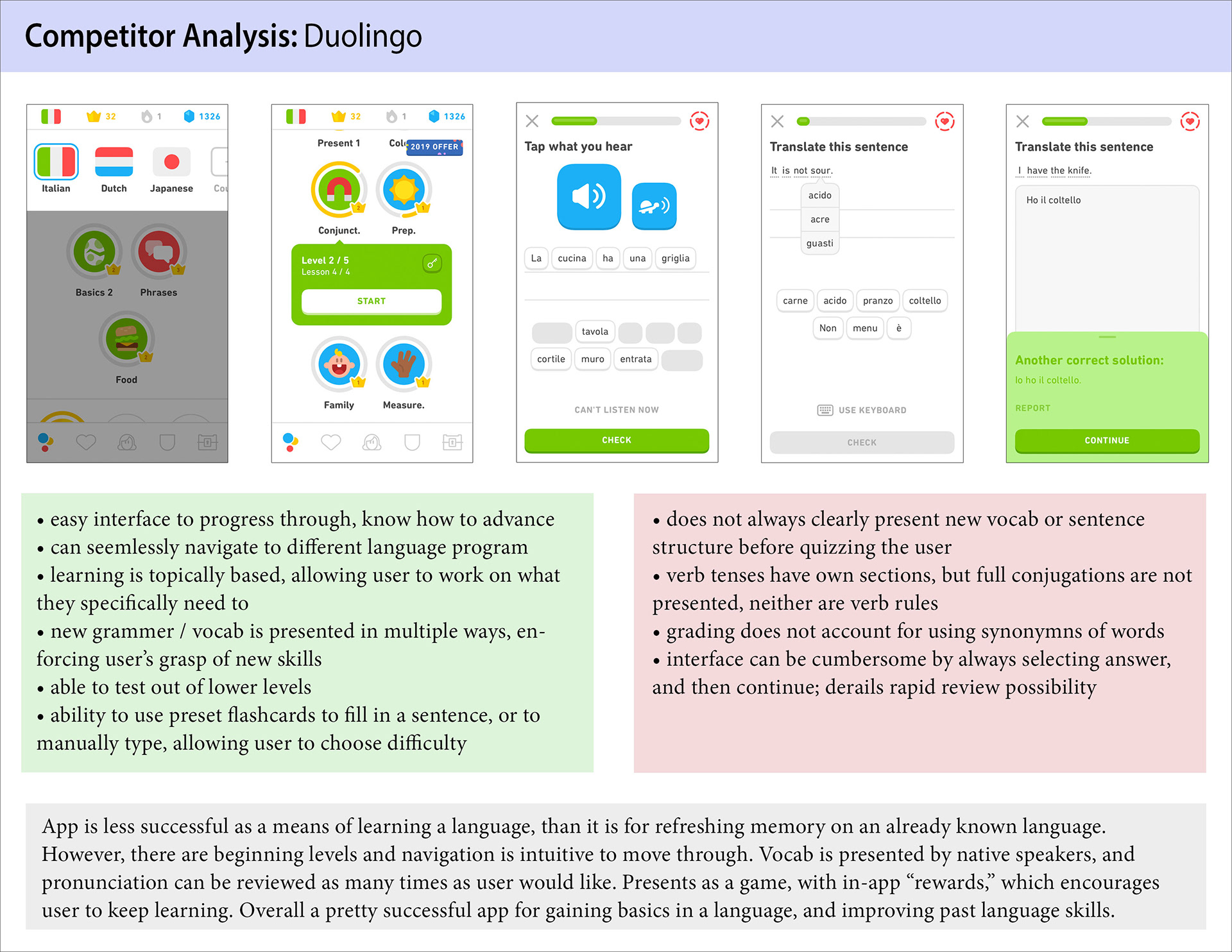
Competitor Analysis
For this analysis, three top competitors on the market were reviewed. Each was carefully analyzed, looking at features such as the basic structures of each app, task flows where friction was encountered, and what made language learning enjoyable.

User Interviews
Before conducting user interviews with samples of our target audience (young professionals), a script was written to target key concerns of language learning. Questions were framed to be neutral, in an attempt to prevent biased answers by interviewees. For these sessions, emphasis was placed on finding out what users liked and disliked about competitor apps.

User Persona
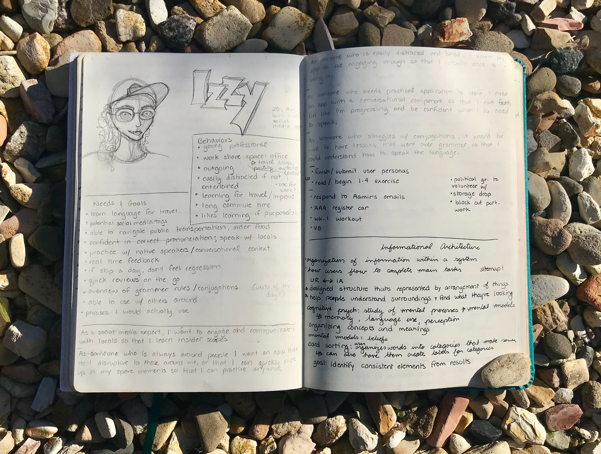
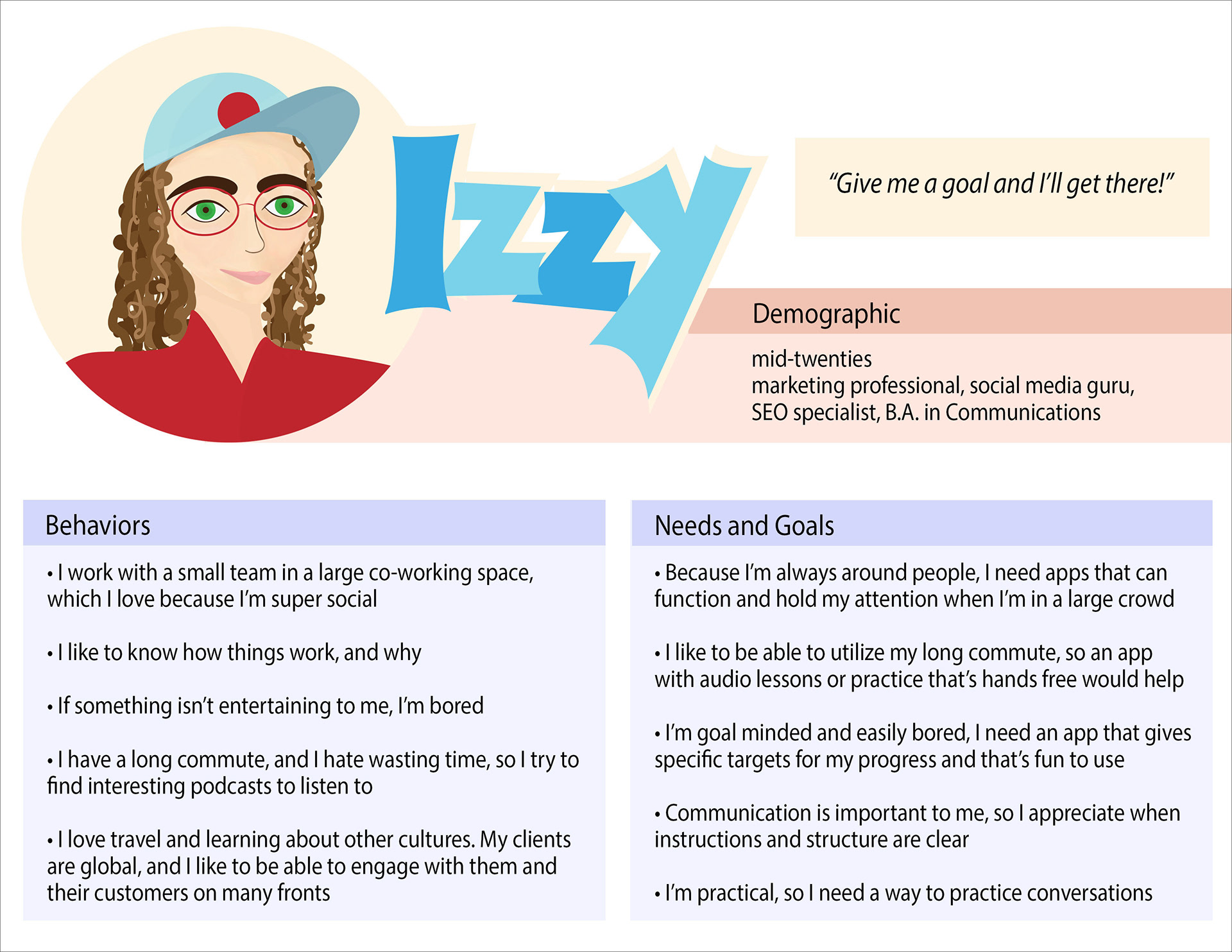
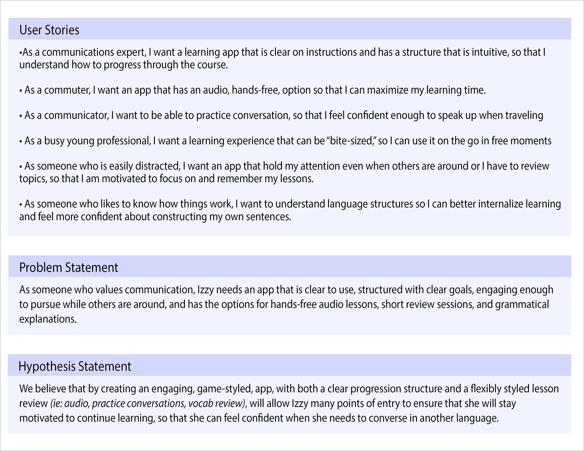
After interviewing a few members from our key demographic, it was time to create a persona; an embodiment of our average user. Izzy helped us to define user needs, wants, and to keep consumer end goals a priority.

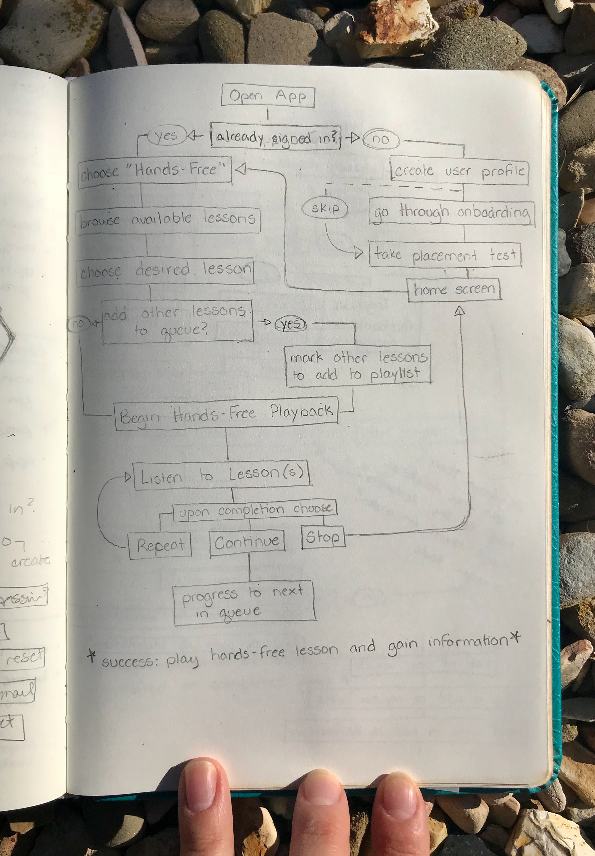
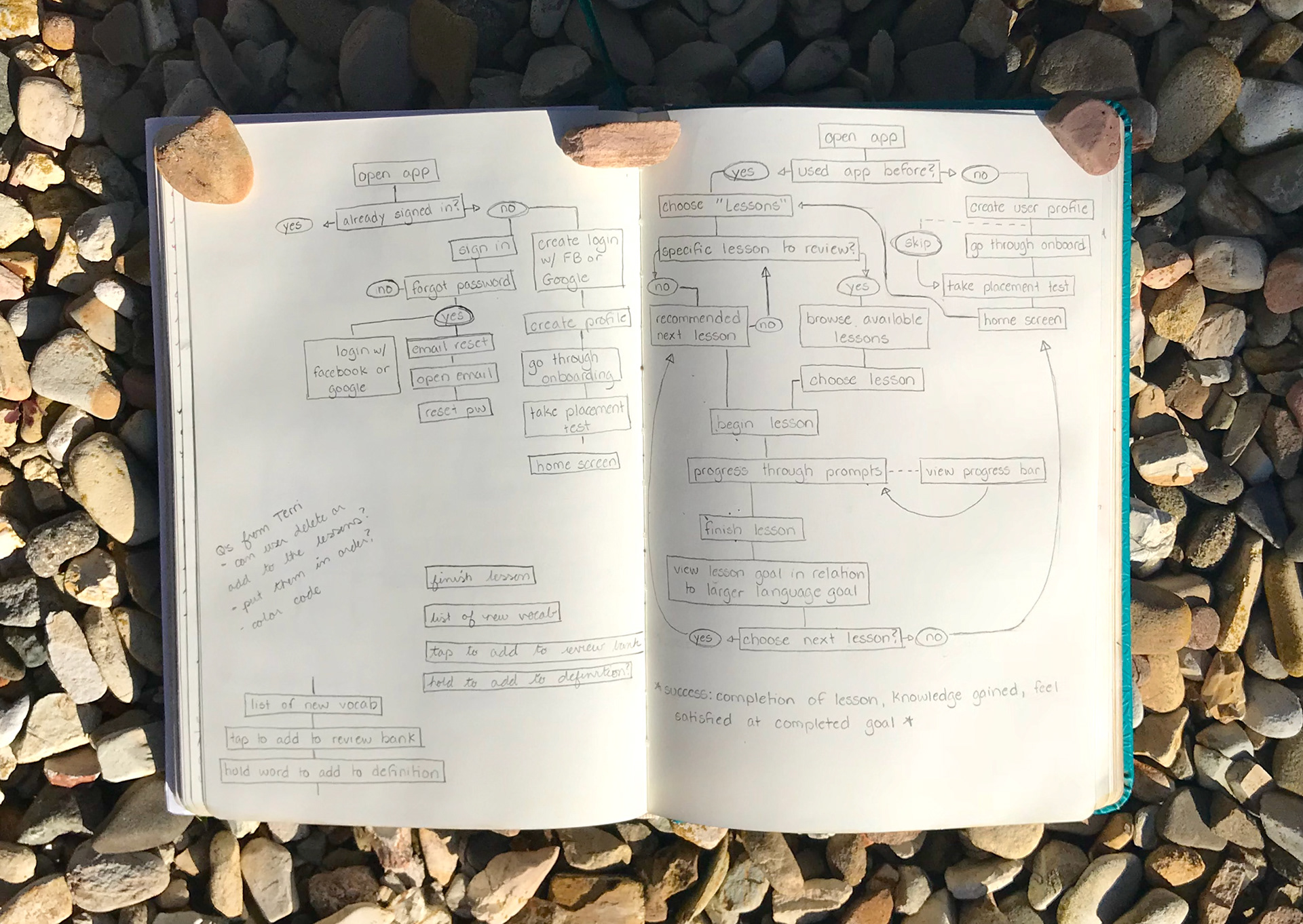
Information Architecture (Task Analysis)
Once Izzy's concerns and goals were defined, we began to flesh out the envisioned app. Focus was placed on two key tasks, deemed essential from research. These two tasks were then looked at, and a user path was created for each.
Wireframes & Prototyping
Using the steps outlined in our task analysis, basic wireframes were blocked out. These, in turn, provided the building blocks for our first prototype that testers would be able to demo.
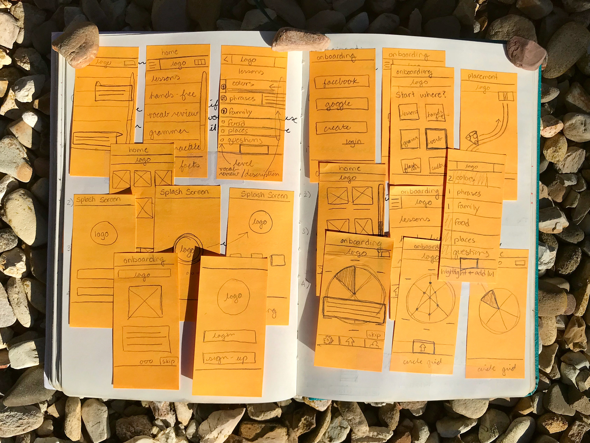

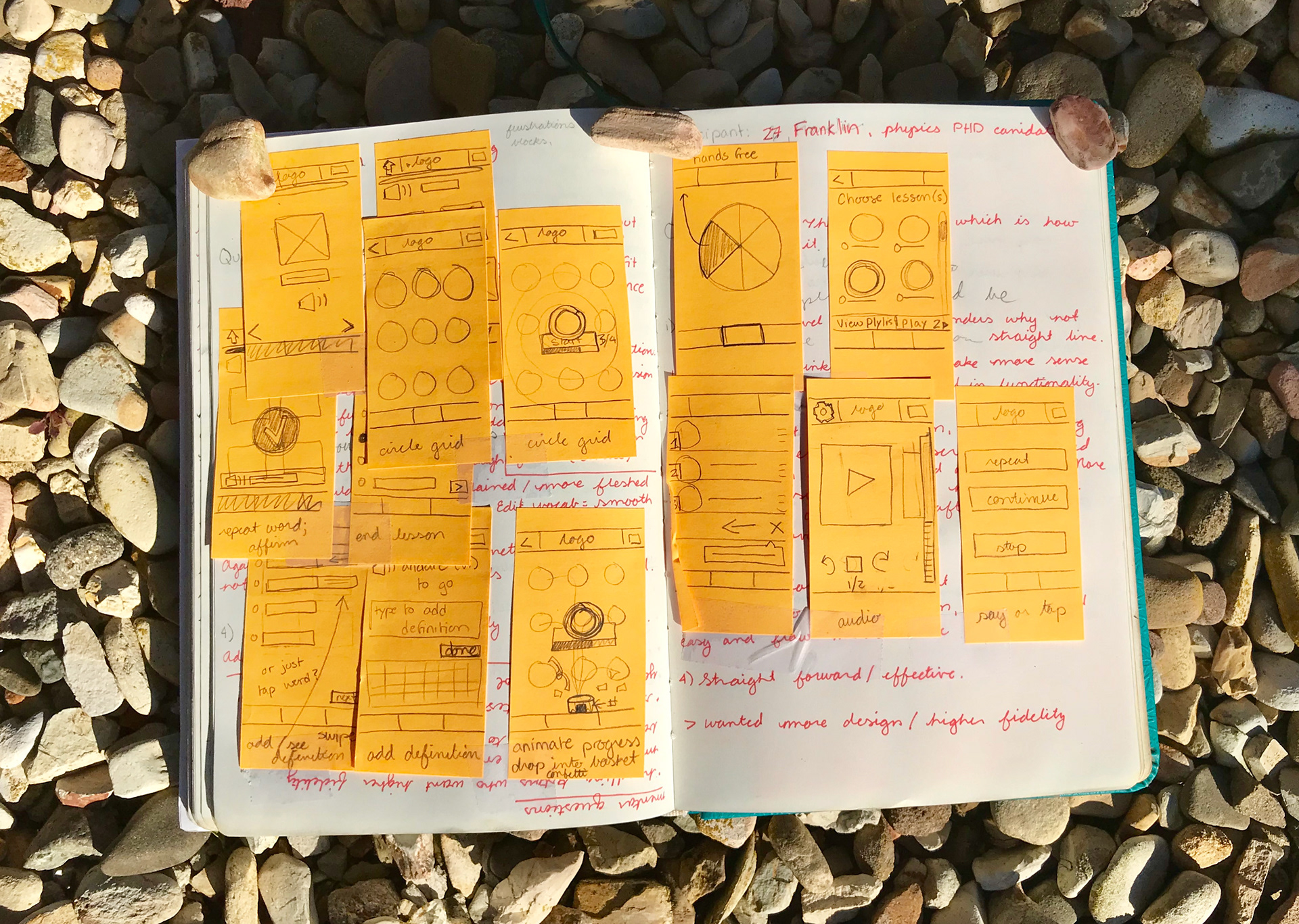
Wireframes (above) and the initial prototype (below).

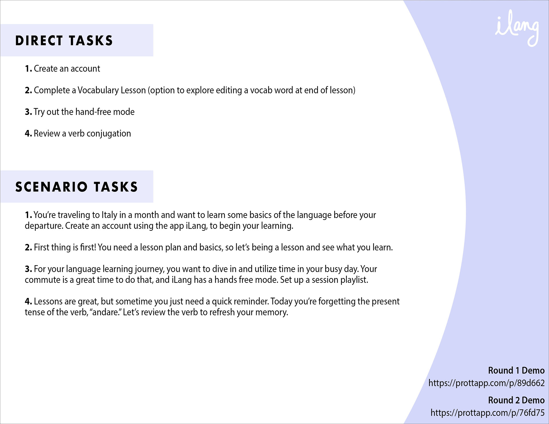
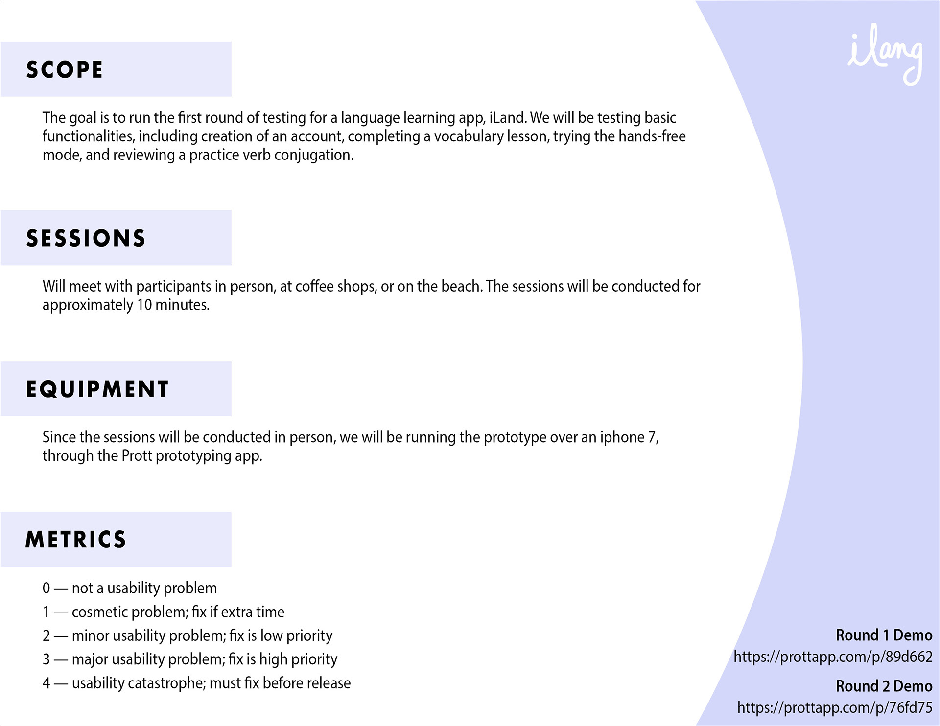
Usability Testing (round 1)
Going into the first round of usability testing, specific tasks were outlined, focusing on the essential features defined by our research and the creation of our persona, Izzy.
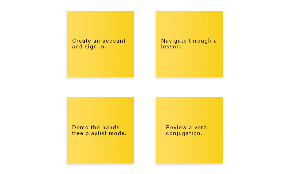
The testing group was diverse, with an age range of 25–60. The spectrum was intentionally kept wide to ensure that the app would be accessible to multiple generations. For each session, the tester was asked to do four tasks, and to narrate any questions or other thoughts they had during the process.
Tasks were as follows:
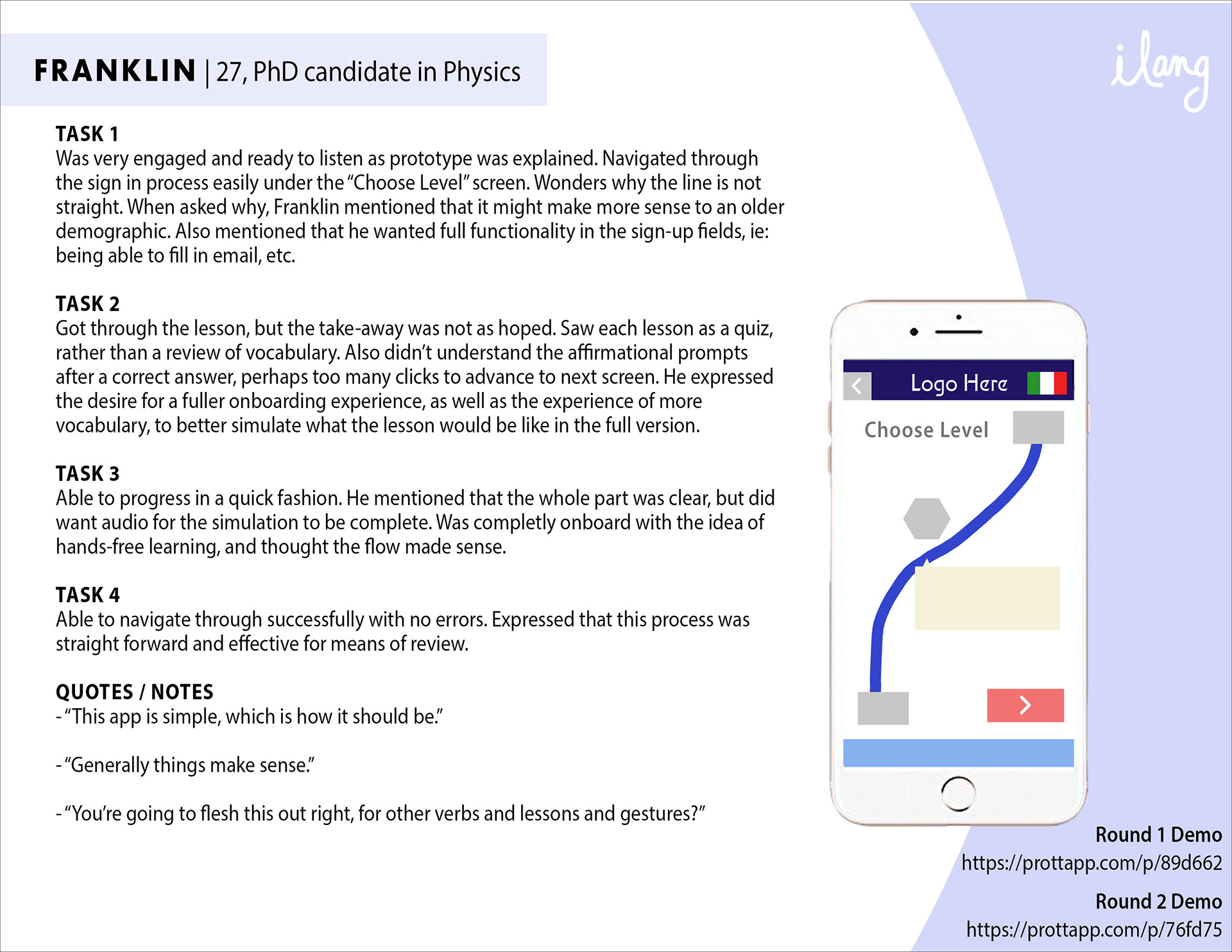
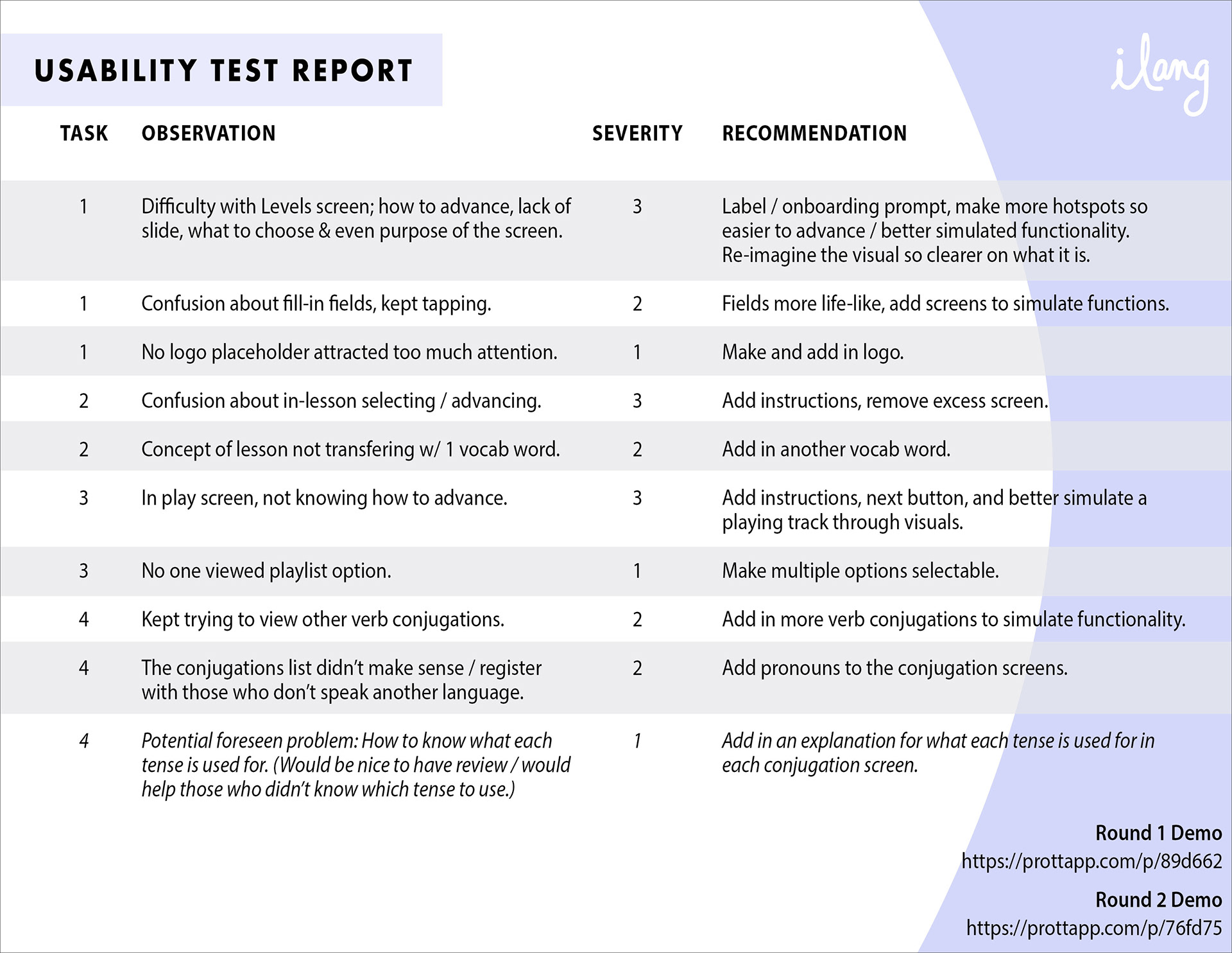
After testing, a usability report was created. This helped to not only identify common problems encountered by the testers, but to rate the severity of issues, allowing prioritization of fixes for the next round of usability testing.
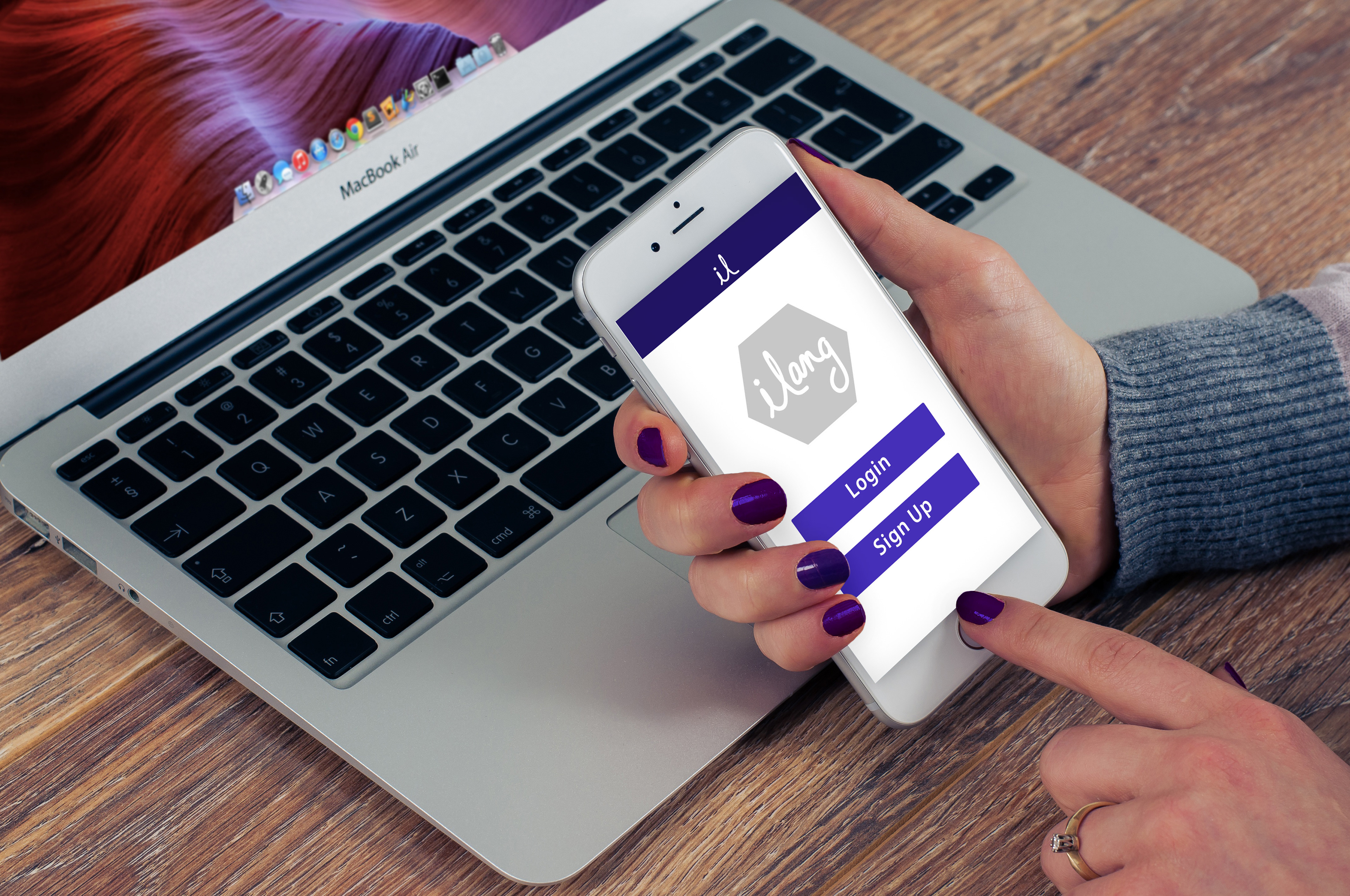
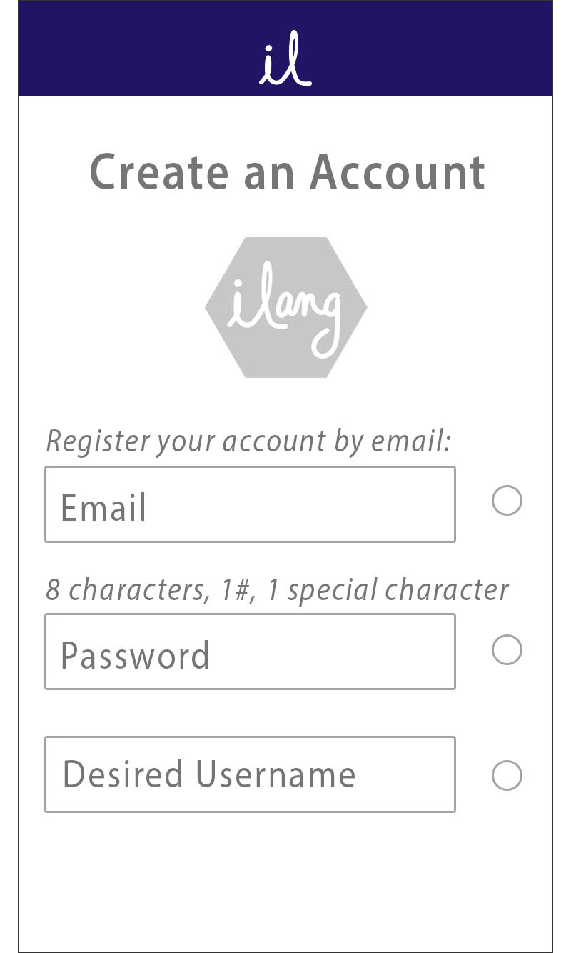
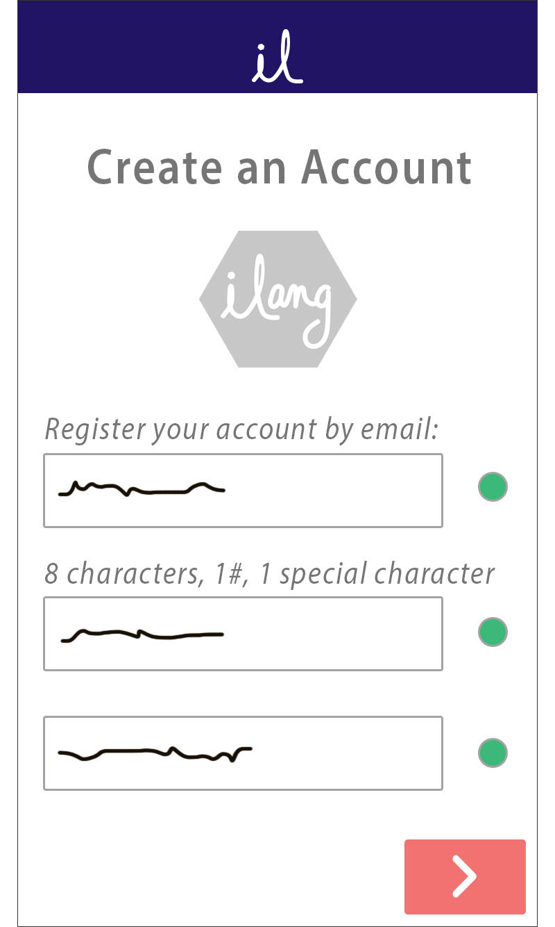
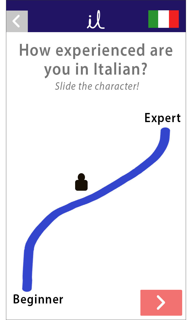
Prototype v2.0
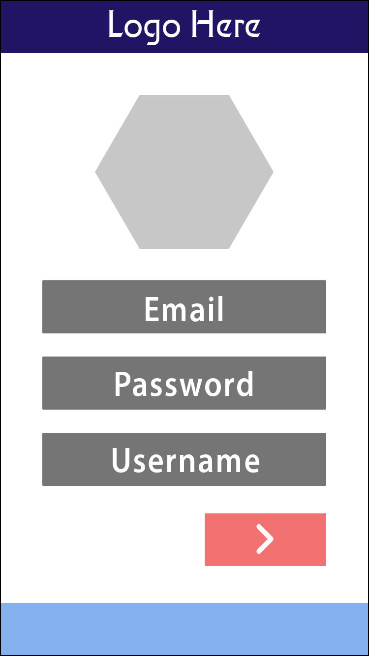
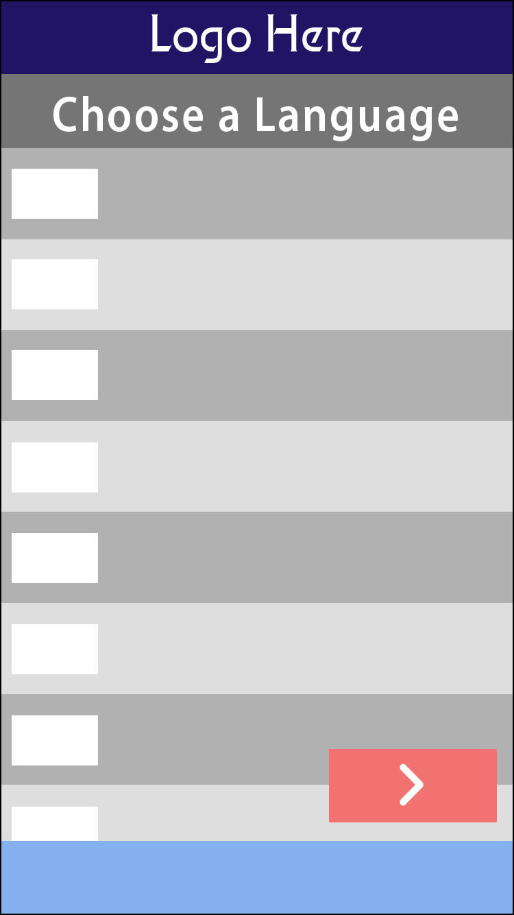
From the constructed usability report, and the verbal feedback from testers, a second prototype was constructed. A large problem identified by our first round of feedback was our sign in and on-boarding processes. Below are screens from the reimagined process, focusing on bringing clarity, and reducing the amount of friction in actions.
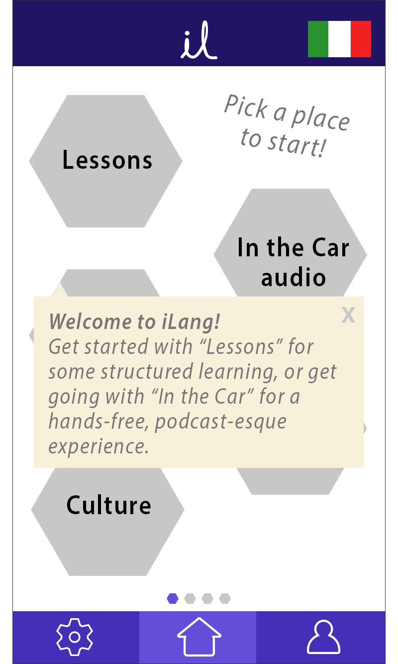
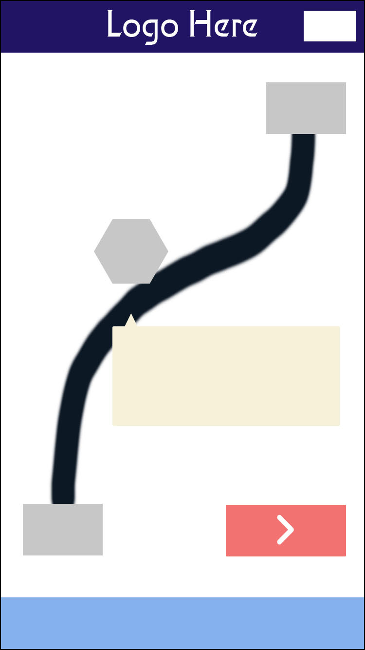
Another new addition to our v2 prototype bars was the addition of progress bars. Added to the lesson sections, the bars provide subtle clues for navigation, helping users orient themselves. It is hoped that these will additionally help motivate learners, part of the initiative to continue making the app more "game-like" and appealing for continued use.
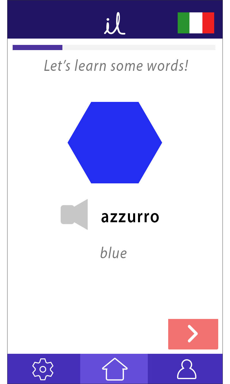
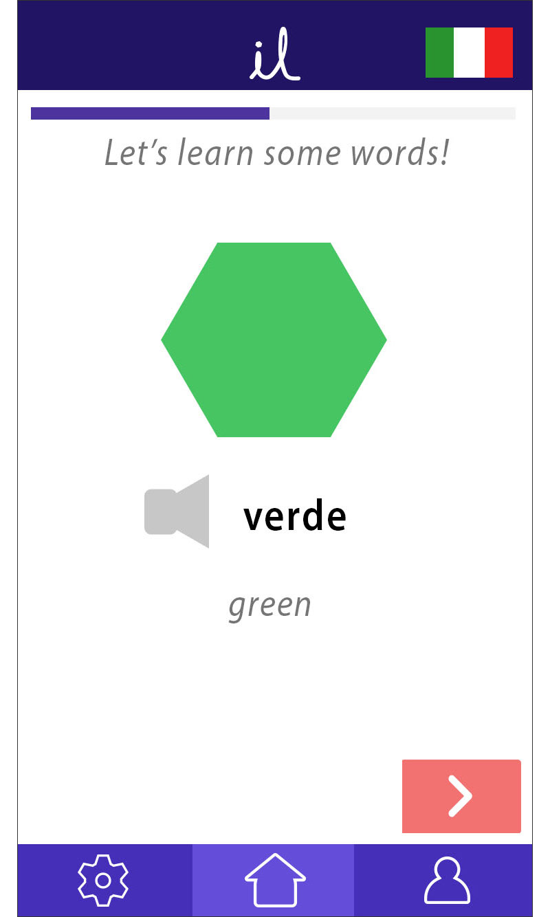
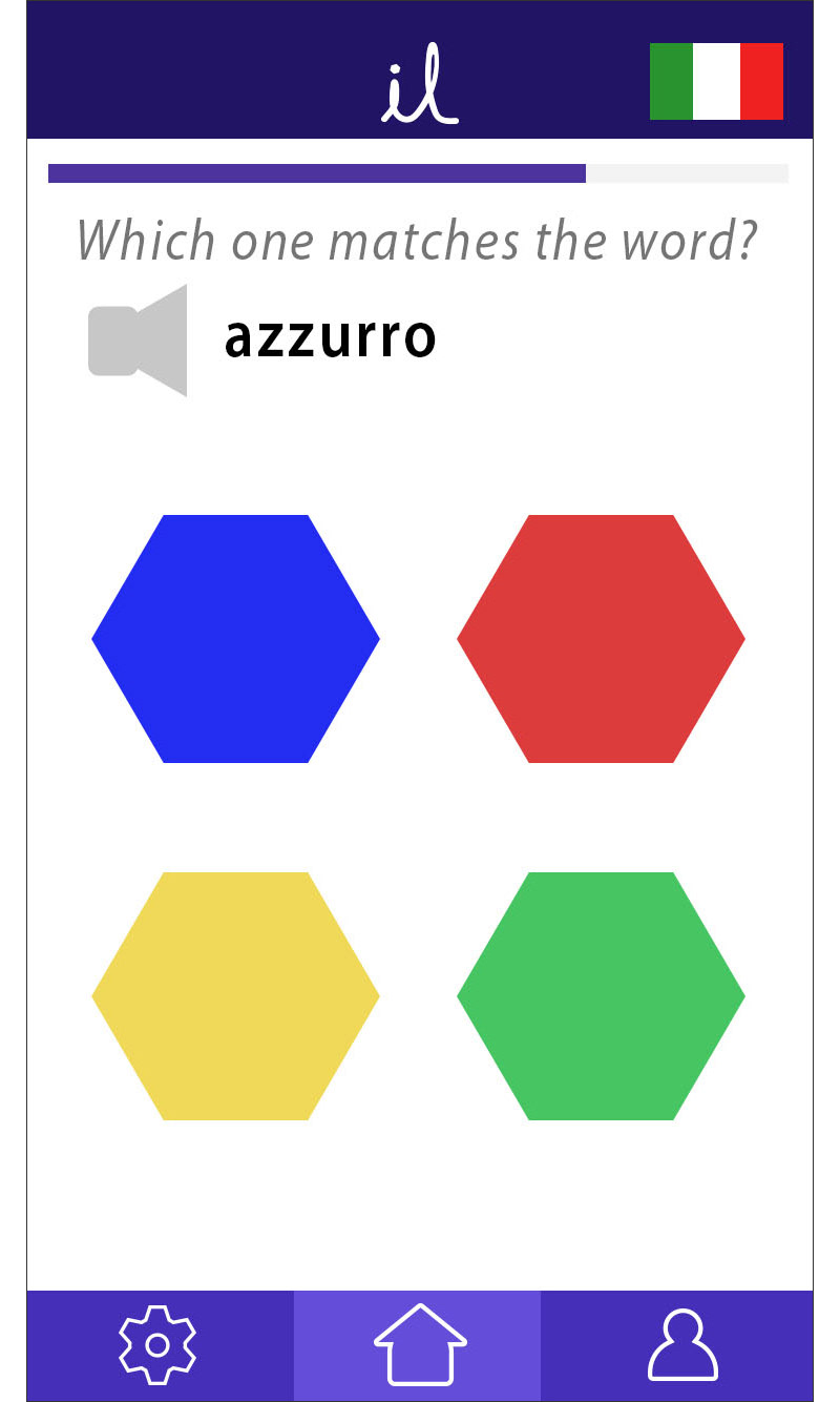
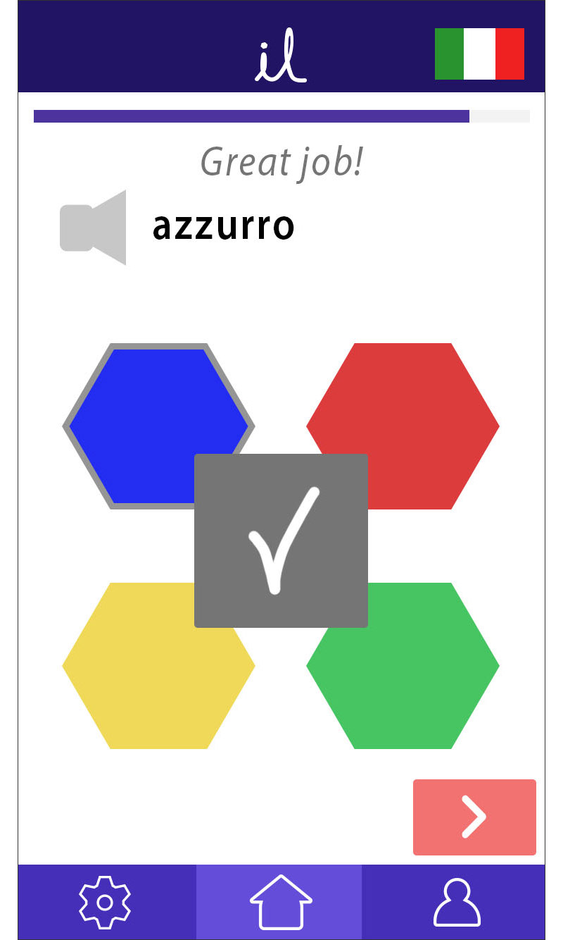
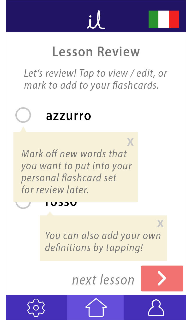
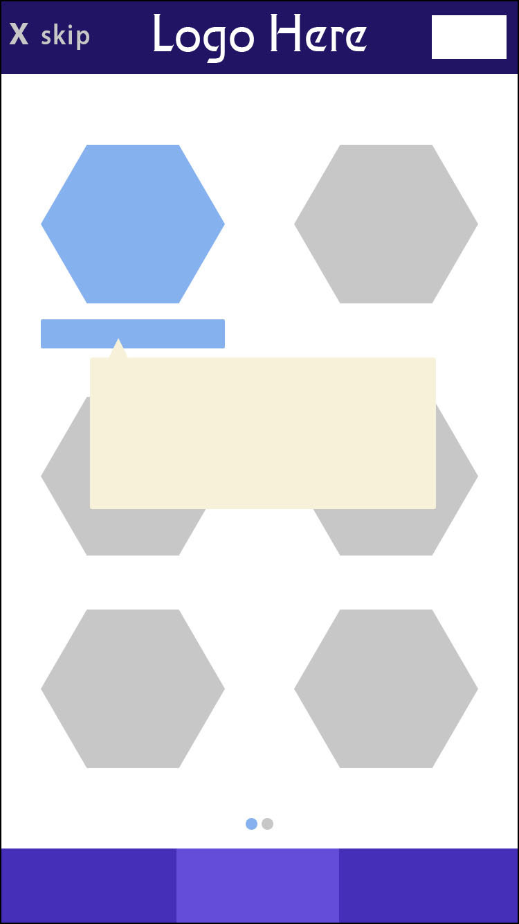
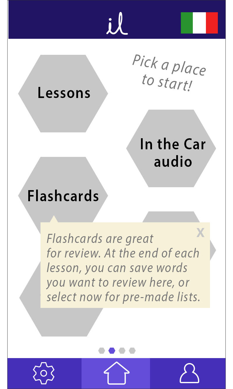
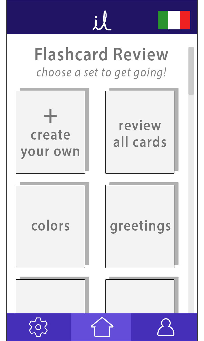
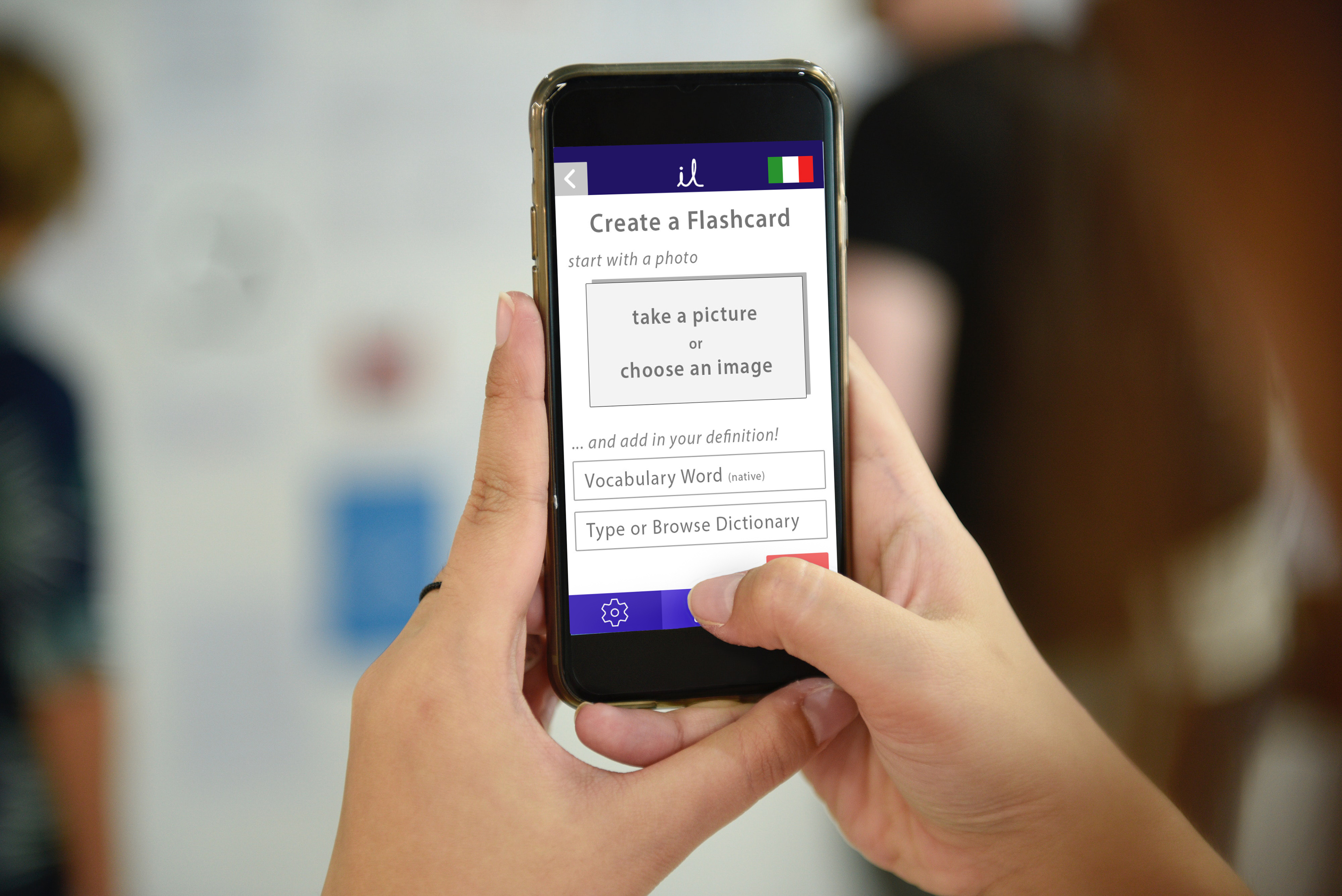
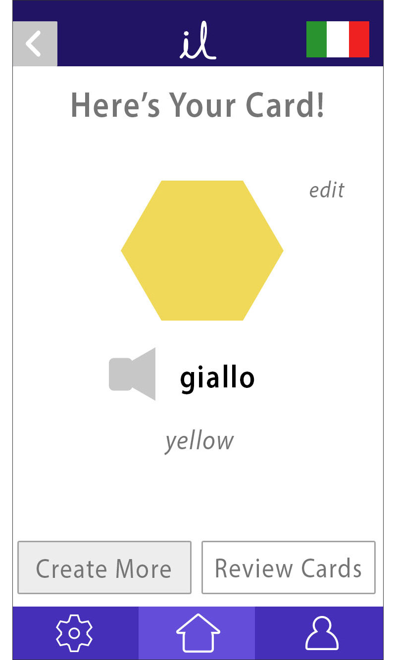
To further dive into the lesson learning section of the app for testing, the flashcard review system was developed. The new section helps testers to understand the connection between lessons and flashcards, as users have the opportunity to add vocabulary words to their review bank at the end of each lesson.
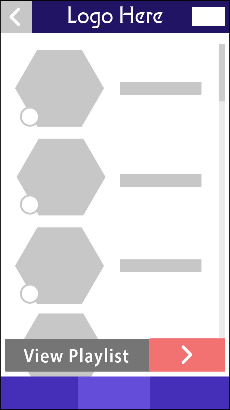
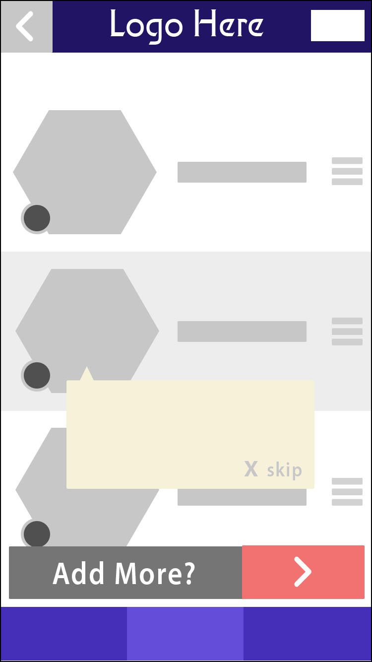
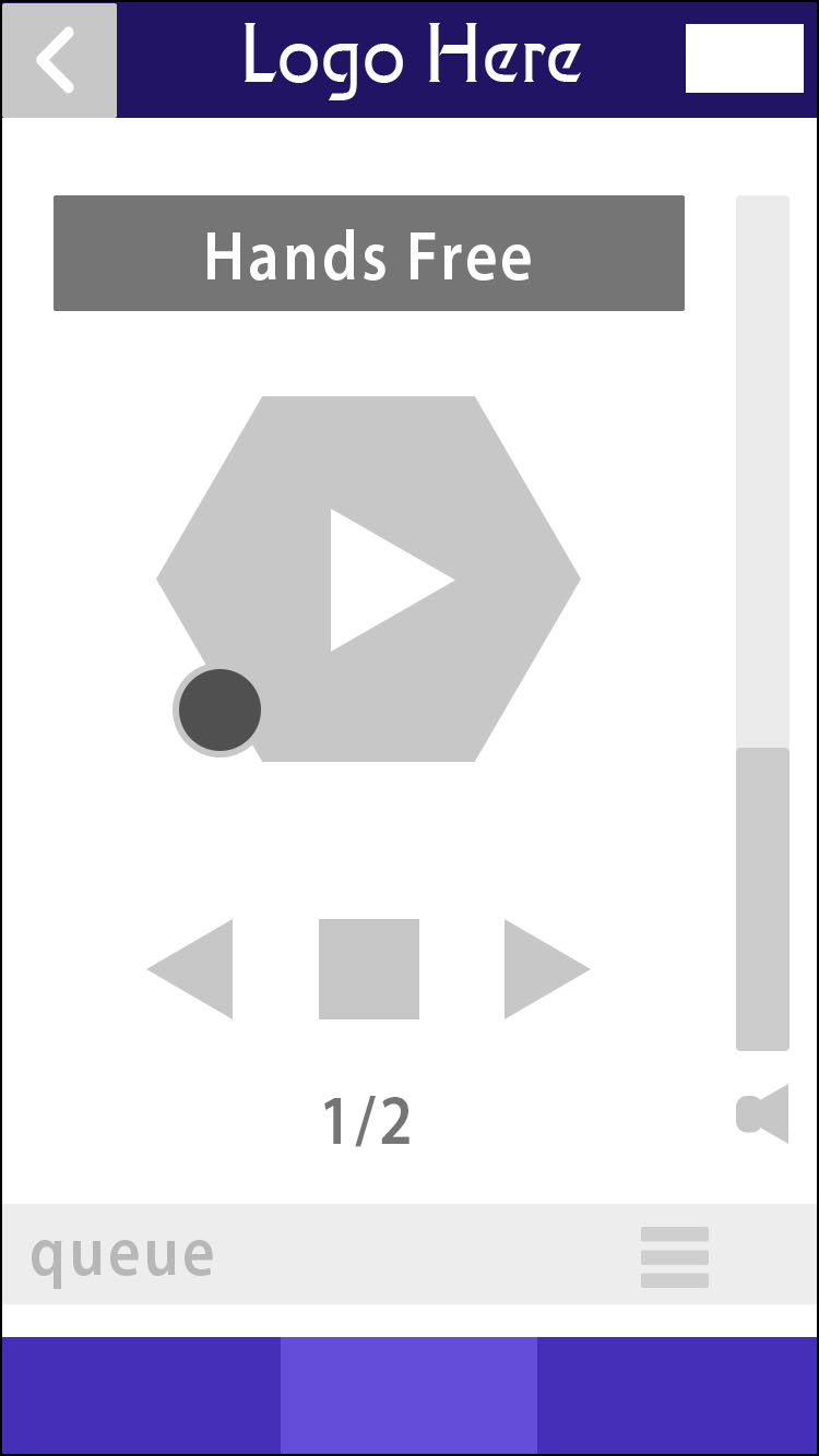
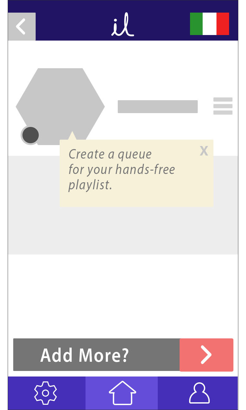
The next section retooled for the second round of usability testing was the "hands-free mode," for use during a commute or when physically engaging with a lesson isn't possible. Icons were standardized for intuitive navigation, an on-boarding process was added, and UI design was cleaned up.


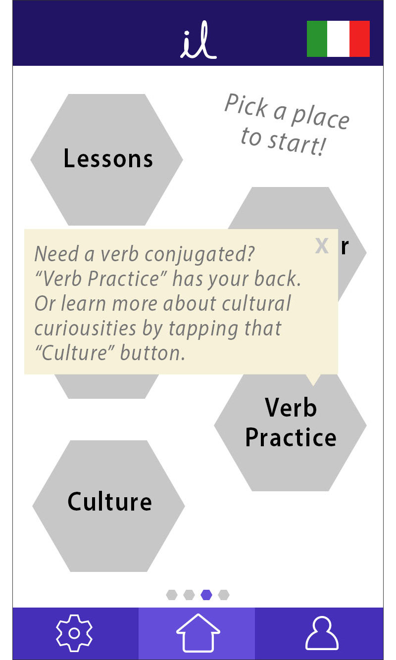
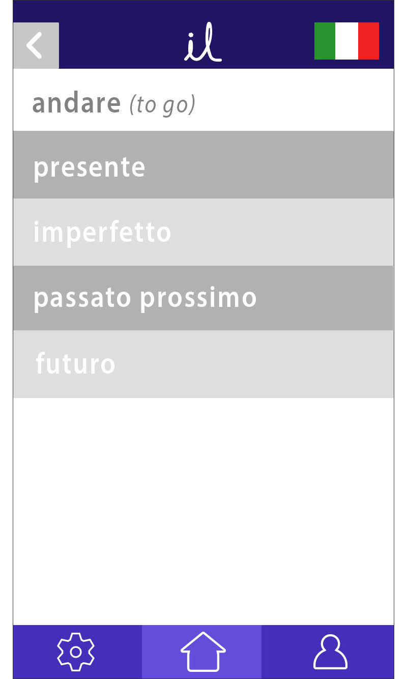
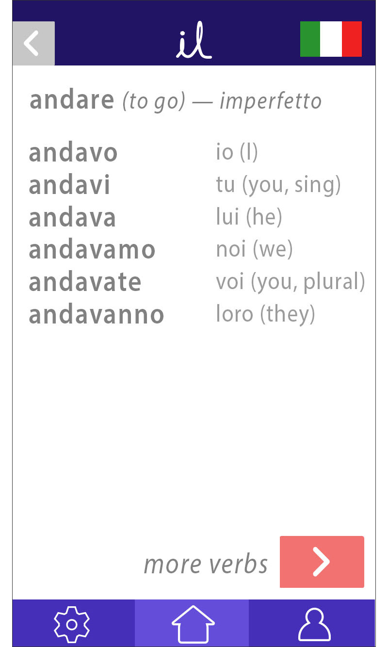
The last section fleshed out for our v2 prototype was the verb conjugations screen, where learners can quickly look up a needed verb. This iteration saw more screens added for clarify of structure, and a refined conjugation screen to specifically show how each verb would look. New cues facilitate understanding for each verb tense.


Overall, our v2 prototype focused on refining gestures and improving navigation in the app — both by adding visual and written cues, and by fleshing out processes. Below is a brief video of how the v2 prototype flows.
Revised Flows; post user testing round 1 (made with Prott)
iLang has yet to see its second and subsequent rounds of user testing, but we are confident that the v2 prototype will resolve the usability issues we observed from the first round. The v2 will no doubt lead to more insights in usability issues, and we will continue to follow our iterative process to continue improving on the user's experience, ultimately resulting in a dynamic, user-friendly, language learning app.